If it ain’t broke…
The first reaction many baseball fans have to sabermetrics goes somewhere along these lines: why complicate things when batting average works just fine? And this is a valid question, why exactly do we need to go beyond batting average in order to figure out how effective hitters are? This first part of the series seeks to explain why exactly sabermetrics are necessary, exploring the inadequacies of batting average and beginning to introduce what we can replace it with.
For those who don’t know, batting average is a measure of how often a player gets a hit. It is the number of hits a player gets divided by the number of at bats (ABs) that they have taken. The number of ABs a player has is equal to the total number of times they go to the plate and achieve an outcome other than a walk, hit by pitch, or a sacrifice hit. A .250 batting average is roughly average, .300 is (these days) elite, and if you have a .200 batting average, your days in the league are numbered. This stat’s simple nature has made it one of the most ubiquitous stats from its ideation in 1872 until modern times.
Part of understanding why batting average isn’t good is also understanding what exactly stats should aim to do. The consensus is that this aim is to evaluate how good a player is (and will be) at doing their job, winning games. So our end goal should be to create statistics which can be used to improve a team and win more games. As a result, we need our statistics to account for many different things and be relatively holistic (though, as I’ll discuss in later parts, including everything isn’t always better).
However, as you may notice, batting average doesn’t do this. All it gives a batter credit for is how many hits they get. The way we can fix this is by accounting for more outcomes. This is where On-Base Percentage (OBP) comes in. On-base percentage is a stat which is calculated by counting the number of times a batter gets on base and then dividing it by the number of plate appearances (note: not ABs) the player has. The numerator (the top of the fraction and the number of times the player gets on base) is equal to H + BB + HBP (hits + walks + hit by pitches). This accounts for more outcomes than AVG, which is why we use it. However, that reason is quite vague and indefinite.
How to show a stat is better than another
How can I make this vague benefit more clear? Great question. By creating a graph! This one is going to be pretty simple. For reasons that are quite intuitive (but, will nonetheless be explained in 201 Advanced Value Stats), we want stats to be able to predict the number of runs scored by a team. So, for this, I went back to 1990 and got all teams’ OBPs, batting averages, and runs scored to regress these values against each other. All code (and data downloaded from Fangraphs—get their membership, I seriously recommend it) used is on my GitHub.
For this comparison, we will be using the coefficient of determination, otherwise known as R-squared. It essentially represents the proportion of response in the y-variable (the dependent variable) that can be explained by change in the x-variable (the independent variable). In this instance, the dependent variable will be runs scored, and the independent variable will be either AVG or OBP. R-squared therefore represents the proportion of the change in runs scored accounted for by batting average.
To put it in terms of a (crude) formula, . The “signal” is the impact which the x-variable (independent) has on the y-variable (dependent), while the “noise” is the impact of other things that aren’t being measured on the y-variable (in the case of baseball, random variation, ignored outcomes such as walks for AVG, and other factors).
OPTIONAL: In-depth explanation of R-squared
To be more correct than the above formula, I’ll have to explain what actually is. Here is the formula:
SSR is the sum of squared residuals, which is also the variation not explained by the model (i.e. the error between the model and reality):
Where represents the predicted y-value by our regression model for observation and is the actual value of y for that observation i. SSR is also known as the sum of squared errors. Essentially, this formula just calculates the error in each of our predictions from the regression and squares it (to avoid negative values, mainly). In the baseball-specific context, this is all of the important variables which are not being included in the regression.
Next, SST, the total sum of squares.
Here, is the same as before and is the mean of the y-values. This value is proportional to the variance in y-values from the mean y-value.
RSS represents the error in the regression function, so if you take that gives you the proportion of the variance in the y-value which is not explained by the model, so taking the complement of this fraction (subtracting it from 1) gives you the proportion of the variance which is explained by the model. The beauty of this is that it works even for non-linear models!
Analysis of OBP
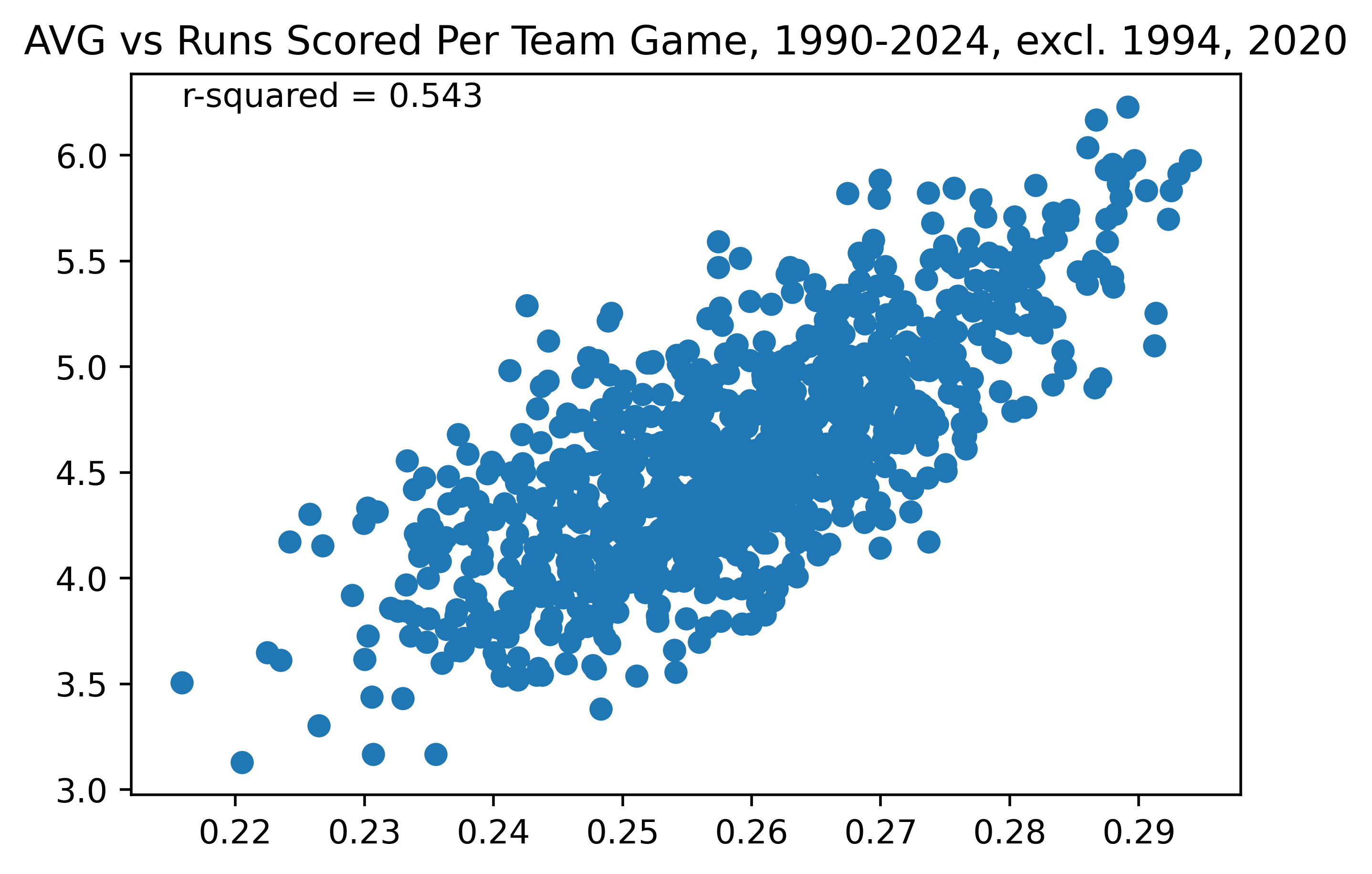 Figure 1. Team AVG vs Runs Scored Per Team Game, 1990-2024, excl. 1994, 2020
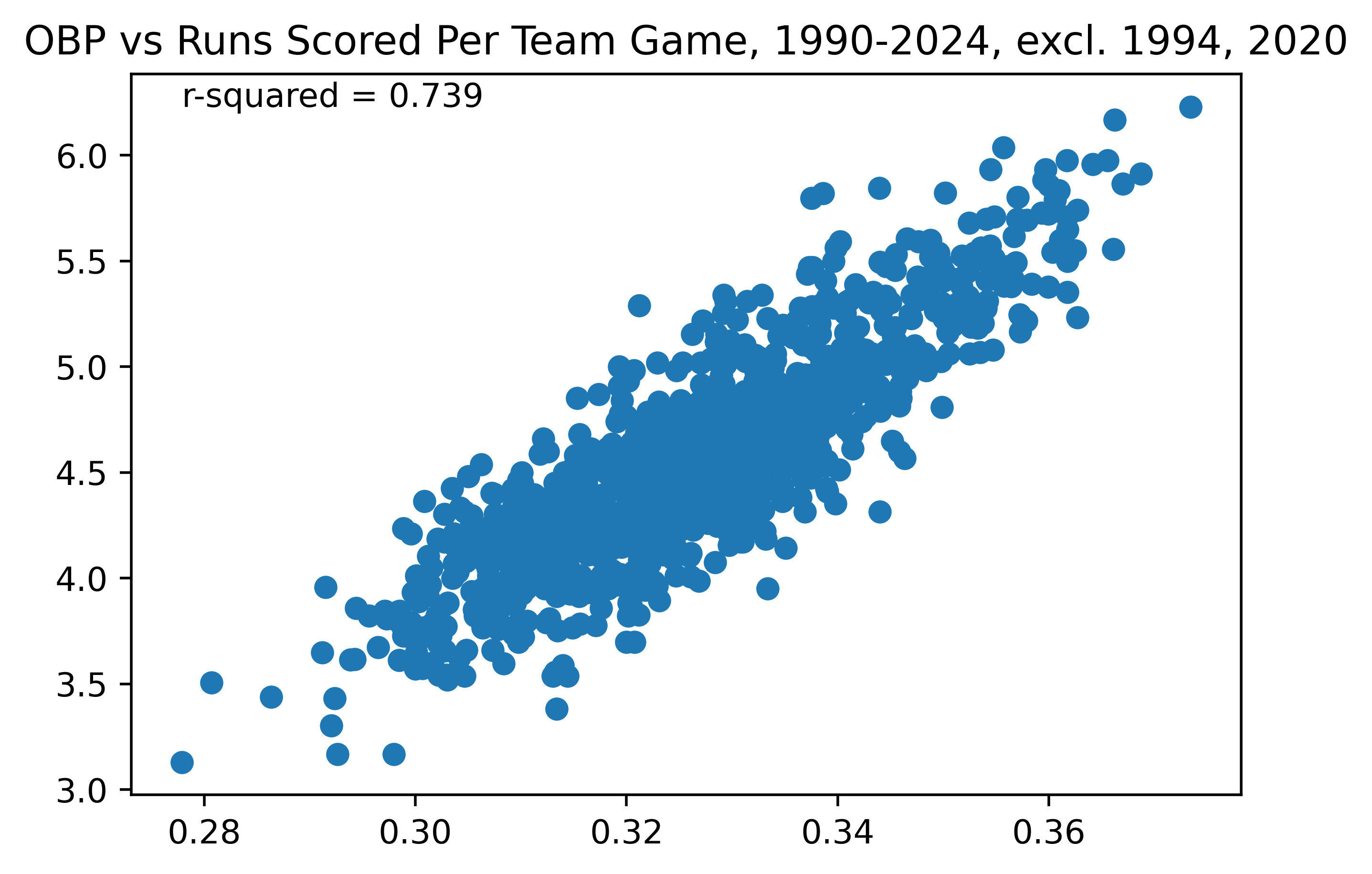 Figure 2. Team OBP vs Runs Scored, 1990-2024, excl. 1994, 2020
As can be seen, the correlation between OBP and runs scored (excluding the two shortened seasons, which have lower sample sizes and thus are more likely to produce outliers) is much stronger than that of AVG and runs scored, with an R-squared of 0.739 in Figure 1 vs an R-squared of 0.543 in Figure 2. This means that OBP is a stronger stat which more clearly correlates with runs scored per game by a team. As discussed above, this is simply because it accounts for more outcomes, rather than just the singular outcome of “hit” or “no hit”. This is why we prefer to use stats like OBP rather than batting average: because OBP better correlates with runs scored.
Table 1 is a table of OBP percentiles among players over a qualified season (a qualified season is a season in which a hitter has 3.1 plate appearances per scheduled game for their league—for a 162 game season a minimum of 503 PAs). It uses data from 2010 to 2024 to give you an idea of what a “good” or “bad” OBP is. Percentiles divide a dataset into equal groups. The 50th percentile is the average player, the 100th percentile is the best player, and the 0th percentile is the worst player. If a player were, for example, in the 90th percentile, that would mean that about 10% of players are better than them and 90% of players are worse than them.
| Percentile | OBP |
|---|---|
| 10th | 0.298 |
| 20th | 0.311 |
| 30th | 0.319 |
| 40th | 0.326 |
| 50th | 0.335 |
| 60th | 0.343 |
| 70th | 0.353 |
| 80th | 0.364 |
| 90th | 0.378 |
| Table 1. Percentiles of OBP among qualified players, 2010–2024 |
As a note, these values are somewhat inflated. The hitters that are able to achieve a qualified season tend to be ones that are better hitters in the first place. Over 2010-2024, the league average OBP (the collective OBP of the league as a whole) has ranged between .325 and .312, averaging about .319, compared to .335 which we get when only including qualified players. But, when comparing players who are able to play full seasons in MLB, these percentile values are fully valid. That is a caveat for all percentile charts in this series unless otherwise stated.
I hope I have successfully preached the merits of OBP. OBP, however, is not all encompassing. A hit is not the same as a walk is not the same as a home run, but OBP treats them the same. That’s why, next week, I will explore OPS and how it aims to fix this problem.