| Original Source | Author | Published |
|---|---|---|
| Run Values by Number of Prior Pitches Thrown | TangoTiger | 2025-07-27 |
At the very end, this includes a cool thing on True Talent!
Run Values by Number of Prior Pitches Thrown
By Tangotiger
I’m going to show you the run production, split by how many prior pitches a starting pitcher has thrown. This data is for 2010–present (meaning thru games of July 25, 2025), including the playoffs.
The production metric I am using is Run Value (per 100 pitches). Do I need to explain Run Value? Bill James once said: if it seems like you are walking in to the middle of a conversation, you probably are, that we can’t continually restart the conversation for the benefit of all the newcomers. For the most part I agree. Sometimes I do restart the conversation to the beginning, but not today. So, I’ll leave it to others to bring along the newcomers.
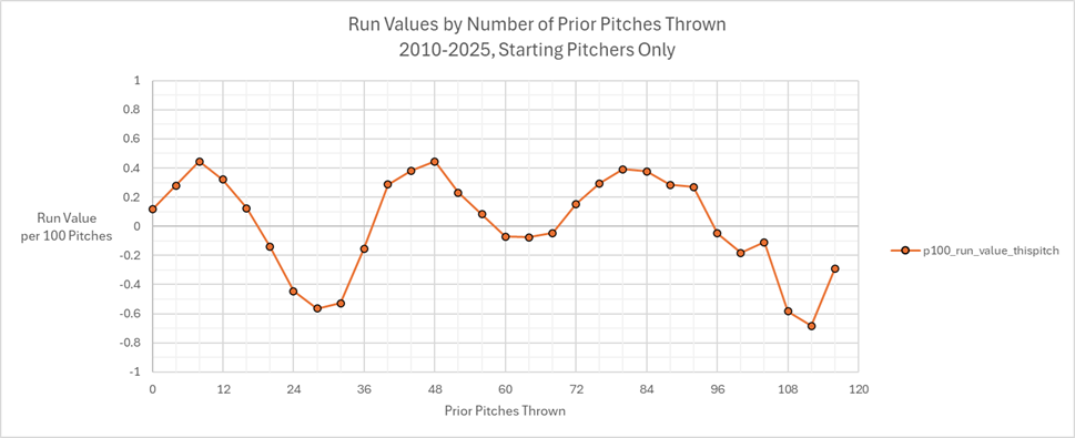
I am grouping the data in groups of 4 pitches. So, that first point, at 0 Prior Pitches Thrown, really means 0-3 Prior Pitches Thrown. (click to embiggen)
Now, if you didn’t know anything about baseball, you’d be really confused about the cyclical nature of what we are seeing here. It seems that run production is maximized at point 8 (meaning 8 to 11 prior pitches thrown) and point 48. And run production is minimized at point 28 and maybe also at point 112 (meaning 112 to 115 prior pitches thrown). I mean, how is that even possible that having thrown 112-115 pitches, run production is at its lowest (meaning batters are at their worst and/or pitchers at their best)?
Well, you do know something about baseball. So, let me remove this Orange Overall production line, and instead show you a Blue Batter line and the Purple Pitcher line. The Batter Line represents that batter’s seasonal average, while the Pitcher Line is that pitcher’s seasonal average.
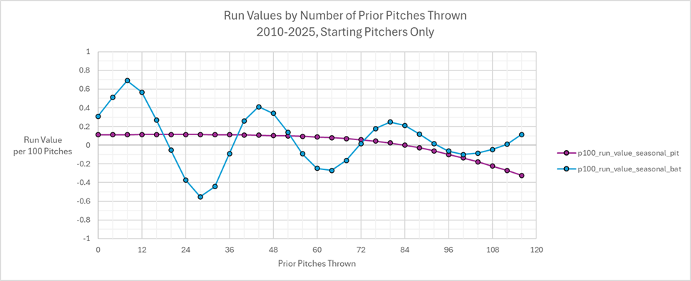
Naturally, for pitches 0 through 20, that’s going to be predominantly the top of the order. That’s why you see the peak there: we have good batters getting those pitches. And since the batting order cycles, you see a cyclical chart.
In addition, we see that up to about Pitch number 70, the Pitcher line is pretty flat. That suggests that every pitcher is going to throw at least 70 pitches in their starts. And then it drifts downward, as the pitchers who survive deeper and deeper into games are the better pitchers, those who suppress run production. This is called Survivorship Bias.
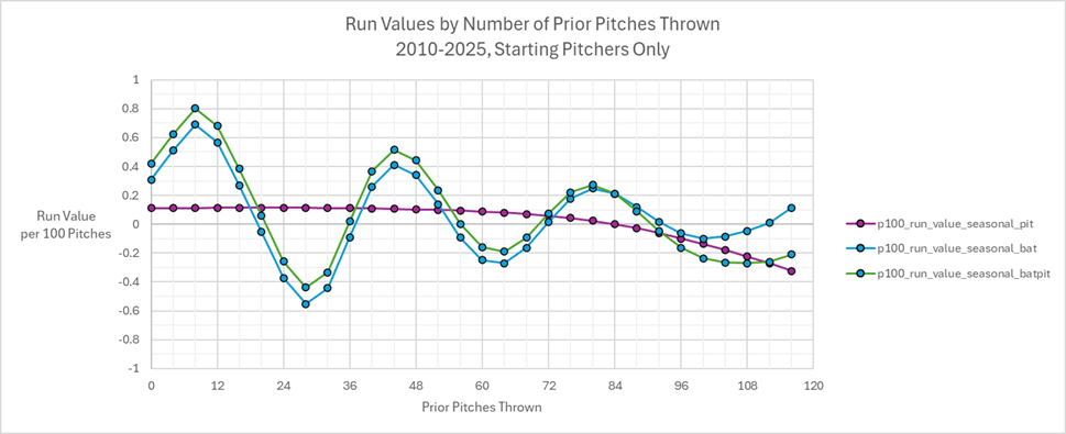
If we add the values of the Blue Batter and the Purple Pitcher, we end up with a Green line, which is our Expected production line. This Expected Value is what we expect based solely on the talent of the Batter and Pitcher involved at that particular pitch count.
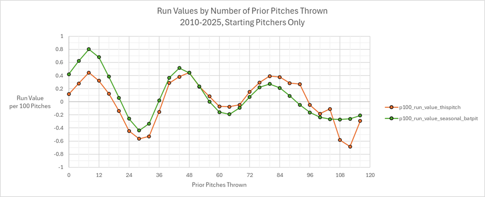
What we then do is compare the actual production (that Orange line we started with) to this expected production (this new Green line). This is how that looks.
Next, we subtract the actual production by the expected production. This difference gives us the actual production, adjusted for expectation.
Now, including the difference of the two lines (and I’ll add in a range around that to account for Random Variation), and this difference will show us the impact of the Pitch Count to run production. I needed the range for Random Variation because the number of prior-pitches thrown gets disproportionately less as the pitch count increases. The range you see there is one standard deviation.
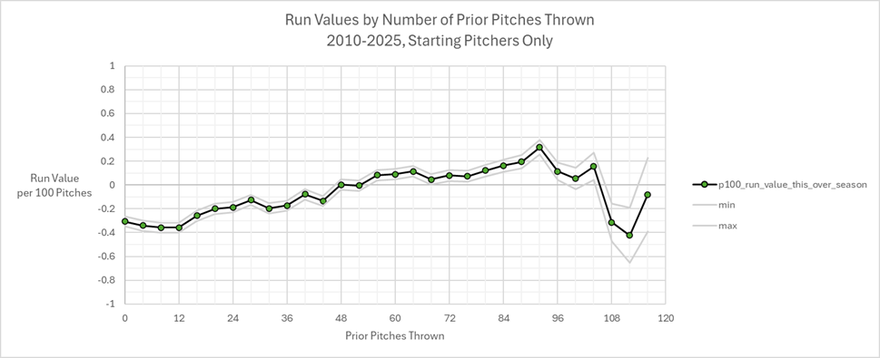
As you can see, the more pitches thrown, the higher the run production. Up to a point anyway. That point is 92, meaning 92-95 prior pitches thrown. After that, run production actually goes down. Or, given the Random Variation, flatlines for a while. But once you get to 108 pitches thrown, run production goes quite low. How is this possible? Well, we do have Random Variation to contend with. But even that won’t explain too much of what we are seeing.
No, what I think could be happening is that a pitcher who is pitching that deep is probably being self-selected as being identified that they are pitching a bit above their head. This is called Selection Bias. Remember, pitchers are human, and that means sometimes they actually increase in talent. In other words, let’s suppose that the average pitcher is pitching his average game, which we’ll call the average of all those an A-minus game. That’s their average talent level. Well, on some days, they may be pitching their A-game or their A-plus game. And other times, they are pitching their B-plus or B game. Their talent level is not fixed, but varies day to day, even pitch to pitch.
Identifying if a pitcher is actually pitching their A-game as opposed to their B-game is not necessarily obvious. It cannot necessarily be determined by their stats either. I am sure that the pitcher themselves might know. But, it’s just as possible that pitchers, catchers, and managers are able to fool themselves into believing whatever they want to believe. It’s a very nuanced thing to know how good a pitcher is actually pitching. Everyone remembers Pedro’s last game in 2003, and everyone is afraid of making the wrong choice. So, they just put in artificial limits to keep themselves from overthinking things.