Before you read this article, I truly apologize for how messy it is. When I was nearly done with editing it for release, I made a realization that kinda changed the focus of the article (hence the title) but also I did not want to fully rewrite it… yet. At some point I will rewrite this to be more digestible and so it doesn’t only get to the point at the very end and republish it. If you just want to read about whether wRC+ is descriptive of run scoring, then feel free to skip to the giant info box near the end and the only actual heading in this article. But the bulk of the article is about the relationship between wOBA and wRC+ and I think it’s very interesting, but that’s just me.
As I mentioned last week, I will not be publishing a proper article this week. 102 Basic Pitching Stats will be starting the week after next (unless in my 3 or 4 hours of free time over the next week I have a burst of writing motivation) so, to fill the gap, here’s something I wrote a few weeks back. I have added some extra content to it (mostly testing my formulas on a large number of players) and tidied it up to make it better, but overall it is the same It is a response in a comment I made (which no one read) to someone on Reddit (so there may be some second person referrals—they refer to the poster) made a post pointing out that one point of OPS+ equalled about 2% above average in OPS. So if average OPS were hypothetically 1.000, a player with a 1.100 OPS (10% above average) would have an OPS+ of about 120. This is pretty intuitive from the formula of OPS+:
OPS+ Formula
Somewhere in here you also need to include the park factor, but I cannot figure out where. Fangraphs’ blogs have been acting up for me lately and I can’t seem to find the article where they have the formula for OPS+, and the formula for OPS+ on Baseball Reference and MLB.com does not include a park factor.
Anyways, you’ll see here that if a player has an OBP 10% above average and a SLG 10% above average, their OPS will be 110 + 110 - 100 = 120, not 110, despite their OPS only being 10% above average. This should be enough context. Below is my original post in response to the observation about OBS+ and wRC+, modified slightly to make it better:
A common misconception is that OPS+ closely matches the ratio of a player’s OPS to that of their league. In fact, due to the additive nature of the two components in OPS+, a player with an OBP and SLG both 50% better than the league average in those metrics will have an OPS+ of 200 (twice the league average OPS+) while still having an OPS that is only 50% better than the average OPS of the league. It would be a better (although not exact) approximation to say that a player with an OPS+ of 150 produces 50% more runs, in a given set of plate appearances than a player with an OPS+ of 100 (though see clarification above, under “History”).
https://en.wikipedia.org/wiki/On-base_plus_slugging#Adjusted_OPS_%28OPS%2B%29
Why is this true? I’m not entirely sure. My best theory is it’s because one point of OBP is worth more in OPS+ than one point of SLG. This is quite intuitive: OBP is lower than SLG—the average of SLG is 1.3x as high as the average of OBP—and OBP has a lower variance—in 2024, the highest team OBP was 25 points above average while the highest team SLG was 47 points above average.
So this means that OBP has an outsized impact on OPS+, with each point being some amount more valuable. I don’t know how much more of an impact it has, but I do know the optimal amount: 1.8 times. So my guess is this formula brings OPS+ closer to the optimal ratio of 1.8:1 for the impact of OBP:SLG.
Now let’s look at wRC+ and figure out why it too follows this pattern of one point equals two percent. It is not quite as intuitive based on a simple observation. Here is its formula excluding the park factor:
In this formula, . The wOBAscale simply scales wOBA to be related to runs scored, because wOBA weights are originally based on run scoring, but then multiplied by the wOBA scale to scale average wOBA to average OBP. So wRAA is just what it sounds like: runs created above average.
In the denominator, you’ll notice that lgwRC/PA will almost exactly equal lgR/PA. Not quite equal (I’m actually not entirely confident why—even when including pitchers, league wRC is about 10 runs lower than league runs scored. I think it’s because the wOBA denominator excludes IBBs, and perhaps so does the PA that Fangraphs uses to multiply in the wRC formula. That’s my best theory, but I’m not 100% sure that accounts for it.
Let’s just simplify that denominator to lgR/PA then, since that’s almost true. This simplification results in this result:
You might think , but it doesn’t, because wOBA weights are adjusted by a constant value to make an out a value of 0 rather than negative, so that division doesn’t work. You can only divide by wOBAscale to get runs when you subtract another wOBA, because that eliminates the adjustment to each of the linear weights that sets the value of an out to 0
Anyways, then, we can find out what the increase in wRC+ is for one percent over average in wOBA is.
We can substitute (where ) to get this:
This is a linear function of wRC+ in terms of n. Finding the gradient, of the graph (and also multiplying the whole thing by 100 to get rid of the denominator on the left side of the equation):
This formula essentially means that wRC+ changes by that amount for every increase by 1 in the value of . So if a player has a wOBA of exactly double league average, their wRC+ will be higher than a league average player (or 100)
wOBA increasing by 1 percentage point relative to league average (a change in n of 0.01) will be 0.01 times the gradient:
In 2024:
So, the difference for each percent above average is 2.13 points of wRC+ per percentage point change in wOBA/lgwOBA.
For 2024, we have this formula for wRC+:
This also gives us also our value of wRC+ when wOBA = 0, which is -133. I somewhat assume Fangraphs just clips it to be -100 at the lowest, which would explain why players have a -100 wRC+ when they’re hitless—they don’t, it’s just some number less than -100.
We can verify this formula by using a player. Aaron Judge, last year, had a wOBA of .476 in Yankee stadium, which has a neutral park factor. If you calculate his value of n, , which means his wOBA is 1.535 times league average. If you take , you get a wRC+ of 214, almost exactly the same as his real wRC+ of 218 (of course I used the more precise value rather than 2.13). This formula used for Aaron Judge is correct because it gives him 100 wRC+ and then gives him 2.13 points of wRC+ for each 0.01 that n is above 1 (achieved by multiplying by 100, then by ).
What’s an even better way to verify this formula? By testing it on every player in MLB in 2024. That’s what I did—even on non-qualified players. Of course, one issue with wRC+ is it takes into account park factors. That inserts noise into the data which isn’t accounted for by our model for wRC+. We know that noise will exist, but I simply want to test how accurate this formula is in general. The way to do that is use a form of wRC+ that doesn’t include park factors. I wonder how I could do that… I know! I can use my baseballquery Python package which isn’t yet smart enough to calculate park factors! But it is smart enough to calculate linear weights and wRC+. So, I used that and found that the RMSE (root mean square error, a measure of error in predictive models which is the square root of the mean of the square of the error in predictions… I know that’s a bunch of word salad, but you can Google the formula and it’ll make more sense) is zero. This makes me pretty confident that the only error with using a formula like this is that it doesn’t account for park factors.
As a side note, my formula is not exactly the same because my calculation of linear weights doesn’t perfectly match Fangraphs—each percentage point above league average of wOBA is worth about 2.18 points of wRC+, not 2.13.
So your observation was correct, but it is in no way a “similar logic” to OPS+. And note that this formula is simply derived from run scoring, so all this means is that a 1% difference in wOBA relative to league average (ie. an increase in 0.01 of n where ) results in a change of run scoring of about 2.13% (of course, differing because wOBA is based on run expectancy and doesn’t perfectly 100% correlate with run scoring). You can verify this last fact on your own by comparing the ratios and for any team. You should get that , meaning that for every percent wOBA is above or below average, R/PA is above or below average by 2.13 times as much. I’ll try with the White Sox; the 2024 White Sox scored 0.0864 R/PA last year, so . They had a wOBA of .272, so . , almost exactly matching what is expected.
Info
The section above is something I wrote in the original comment. In trying to verify it on many teams (from 2010-2024), I discovered that the trend is not quite perfect. As it turns out, by pure coincidence, the 2024 White Sox (the team I chose without trying any other teams first) are the team since 2010 who follows this formula the closest. Which is sort of crazy.
Anyways, the actual average value of the ratio between the percent above average a team is at run scoring and a percent above average a team is at run scoring is closer to 1.879 (after removing outliers outside of the range —there were about 20, because when you divide two numbers which have a mean of zero, any tiny amount of variation can lead to a value very large in magnitude from the division—but that didn’t change the rest much). I actually have no idea why this is. Could just be random noise (though it’s a pretty large sample of 14 years’ worth of teams), could be some systemic issue with wRC+ for estimating team run scoring.
Wait, does wRC+ overestimate variance in run scoring?
Before going into this section, just wanted to let y’all know that this section (and the info box above) is something new I wrote for this article, which explains why it feels so sudden and disjointed (and comes so late with no warning). So much for the article being low effort.
Anyways, let’s change what we’re looking at. The formula above is really quite confusing and a weird approximation of wRC+. So let’s use real wRC+ and compare it to the value above (which I will rename from now on to be R/PA+, because it is essentially just a stat like wRC+ but for run scoring, where 1 is league average run scoring, 1.1 is 10% above average, 0.9 is 10% below average). Also, for this, I’m switching back to using Fangraphs’ wRC+.
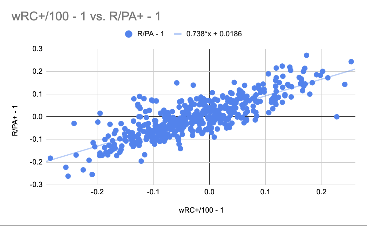 Figure 1. wRC+/100 - 1 vs R/PA+ - 1, 2010-2024
In Figure 1, I subtracted 1 from each value to normalize them so 0 is the mean. It shows that there is a very strong relationship between wRC+ and the percent above average of the rate a team scores runs at. Great! But, I want to draw your attention to something: the gradient of the graph. You might expect, given the premise of wRC+, that one point of wRC+ would correspond with one percent above average of run scoring. But the gradient of 0.738 actually shows that, for each point of wRC+, run scoring only increases by 0.738 percentage points above average. This is a very interesting observation, and I have no idea why this happens. wRC+ still correlates well with run scoring, but it doesn’t correlate in the way I’d expect it to. If I figure out why this happens, I will add the explanation to this article.